

TailwindCSS-3 基本CSS類別:按鈕示範
當使用了TailwindCSS後,所有HTML預設的標籤樣式會被全部移除,因此<h1>、<h2>等內容都不會再變大了。
title: TailwindCSS類別
說明:https://tailwindcss.com/docs/padding

1. 按鈕
<head>
<meta charset="UTF-8">
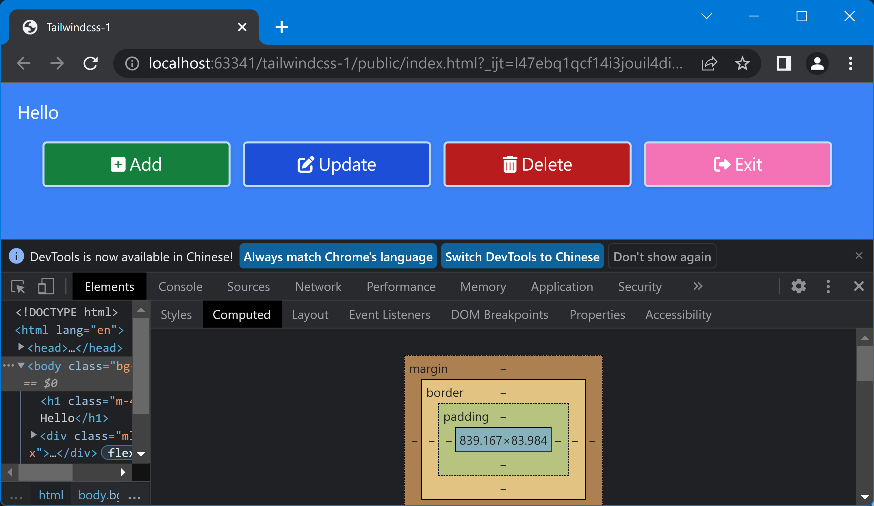
<title>Tailwindcss-1</title>
<link rel="stylesheet" href="styles.css">
<link rel="stylesheet" href="https://cdnjs.cloudflare.com/ajax/libs/font-awesome/6.0.0/css/all.min.css">
</head>
<body class="bg-blue-500">
<h1 class="m-4 text-white">Hello</h1>
<div class="mt-10 ml-10 mr-10 flex">
<button class="px-4 py-2 text-white bg-green-700 rounded border-blue-200 border-2 shadow
focus:border-red-600 hover:bg-green-200 hover:text-black
md:w-1/4">
<i class="fa-solid fa-file-plus"></i> <span>Add</span>
</button>
</div>
</html>
- 圖示使用FontAwesome
- m, mt, ml, mr: 設定按鈕區的邊界
- p, px, py: 設定按鈕的填充大小
- text-white, text-black: 設定文字前景顏色
- bg-顏色-深度: 背景顏色
- rounded: 圓形邊框,另有大小:
- rounded-?? (none, sm, md, lg, xl, 2xl, 3xl, full)
- rounded-##-?? (#=t, r, b, l, tl, tr, br, bl)
- border 邊框粗細
- border, border-x, border-y: 1px
- border-?? (0, 2, 4, 8) px
- border-#-?? (#=x, y, t, r, b, l)
- border-顏色-深度: 邊框顏色
- shadow: Box陰影
- shadow
- shadow-?? (sm, md, lg, xl, 2xl, inner, none )
- focus: 有焦點時,hover: 游標經過時
- md: 中等大小時 (md=Medium), 斷點:
| 斷點 | 意義 | 大小 |
|---|---|---|
| sm | Small | 640px |
| md | Medium | 768px |
| lg | Large | 1024px |
| xl | Extra Large | 1280px |
| 2xl | 2x Large | 1536px |
2. 相關鏈接
##
您可能也會有興趣的類似文章
- TailwindCSS-4 登入畫面 (0則留言, 2022/11/04)
- TailwindCSS-1 用IntelliJ IDEA 學習TailwindCSS (1則留言, 2022/11/02)
- TailwindCSS-2 JIT CSS編譯與JIT設定 (0則留言, 2022/11/02)
- [jQuery] 動態建立元素的事件觸發 (0則留言, 2015/10/25)
- [HTML&CSS] 鎖定左側功能選單,不隨頁面捲動 (0則留言, 2007/04/05)
- 把文章的分類當做HEMiDEMi的標籤:Xuite自動書籤按鈕 V1.3 (2則留言, 2007/02/27)
- 修改自動產生分享書籤的按鈕 (4則留言, 2007/02/11)
- [React-01] 使用IntelliJ IDEA學習React (0則留言, 2018/06/24)
- 初試AJAX:中文的傳遞與接收 (0則留言, 2007/03/16)
- 「網頁載入中,請稍候...」的簡單作法 (17則留言, 2007/05/02)
- 用樣式控制Google AdSense廣告顯示的位置 (13則留言, 2007/05/03)
- 顯示氣象局的紅外線雲圖 (2則留言, 2005/09/22)
- [jQuery元件] Fancybox 3使用備忘 (0則留言, 2018/08/26)
- jQuery DataTables範例1:啟始設定 (0則留言, 2011/10/20)
- IE和FireFox存取同名物件有不同的作法 (0則留言, 2007/04/08)

Sorry, 很久沒用Google sc…